Using Midjourney for Character Portraits, Part 2: Prompt and Output
Midjourney is an AI-powered image generation tool that uses a text-based prompt. The quality of a prompt, especially character portrait prompts, can be the difference between frustration and success. Prompt and output relate to each other in ways that aren’t immediately intuitive, but become obvious after some time using Midjourney.
A prompt can fail because of subjects, and it can fail because of style. Knowing how to create prompts that optimize your chance of success will make your Midjourney experience better.
In the previous post of this series, I wrote about setting up to use Midjourney, but only briefly touched on what a prompt is. Today I’m going to talk about how to set up prompts for character portraits.
Assumptions
I am making a couple assumptions here.
First, remember that Midjourney never recreates an image you provide it. It only does style transfer. When you use an image prompt, it’s going to create something similar to that image. More on that later.
Second, I’m assuming that you are willing to go through some trial and error. This is more feasible if you have a standard membership, which runs $30/month, but you can still do it on the trial or basic plans. Most of what I’m sharing today is what I’ve learned from making more than a thousand images using the tool.
A good prompt with a minor issue can have iffy output, so always check for typos or other issues before beginning.
Third, you understand GAN-based AI limitations. It is good at depicting single subjects. It is not great at understanding interactions between objects. Subject and background might be okay, but it’s looking at words from your prompt without understanding them. If you say “a man hides behind a wall” it will try to draw man, hides, behind, wall. However, this will not produce the intuitive outcome.

Now, from a certain perspective, this man is hiding behind a wall, and some of the pieces are compositionally interesting, but it’s probably not what you wanted.
Fortunately, character portraits work so well because they don’t care about this.
Before We Begin
I’m going to be using some special arguments in my prompts, but I won’t discuss those at length until the third part of this series. Here are the arguments that I’m using (I use –cleanportrait as a shorthand for some of these) to combine some of these:
–uplight: Prevents excess detail over-rendering, most suitable for an artistic style but rarely causes problems in even more “realistic” styles. This has no effect because I’m not fully upscaling, but it is baked into –cleanportrait.
–ar 2:3: Makes a portrait-format image instead of the usual square image. When upscaled, it comes out to around 1024×1536 pixels, instead of the standard 1024×1024.
–fast: Runs fewer iterations of an image between start and finish. I wouldn’t normally do this for portraits, but I’m on Midjourney’s relaxed mode and have run more than 3000 images this month so it keeps the wait times from being prohibitive. Since I’m showing variation examples and not full-scale renders, the difference is negligible here.
–no glasses, eyewear, goggles, nose, long neck: Fixes some common AI rendering issues with faces. It’s worth noting that these can still be explicitly added in if you want them, since the weight here is about half the weight of an average prompt (or twice the weight of a default image prompt).
It is also possible to separate things in various ways; you can use natural language separators, such as commas, and these generally work. However, to specify two entirely separate influences you can add :: to the prompt. This gives each an equal weight by default, though adding a number (e.g. green::2) will tell the AI to weight it more strongly.
Step 0: Images in your Prompt and Output
Using an image in a prompt has effects that are not immediately intuitive.
Midjourney does not do style transfer or iterate on an image you provide it. Instead, it looks to that image, tries to gather information from it, and then uses that information to work on a final result.
This means that you can feed an image into Midjourney and you will have very random subjects.
What you will get from an image, assuming you have nothing else that interferes, are subject(s), style, and color.
This means that if you have a portrait that you want to feed Midjourney, you will get similar portraits. This assumes that Midjourney is able to correctly identify the subject and features of the image, which is not always a guarantee, but you can always specify further detail in text to help guarantee the features you want.
To use an image prompt, simply paste the URL of an image at the start of your prompt. I know you can use at least two images, but I don’t know what the full limitations are.
An image, by default, has a weight of 0.25, meaning that it counts less than the actual text of a prompt. The weight of images can be adjusted by adding –iw to the end of the prompt. Note that just using an image should have the same effect regardless of the image weight if there are no other prompt elements. Officially, the maximum image weight is 1, but I’ve seen people mess around with higher weights. I’m not sure if it has any effect.
For reference, I’ve taken a stock art portrait from Pixabay and run it through Midjourney directly to get a similar result.
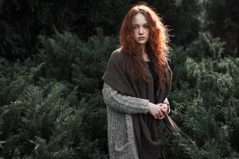
The final results from running this image were:
Prompt: https://cdn.pixabay.com/photo/2016/11/29/03/36/woman-1867093_960_720.jpg –fast –iw 1.0 –cleanportrait
(I had to specify the image weight because –cleanportrait has tags to remove long necks, eyewear, and extra noses)
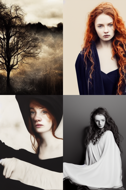
As you can see, it doesn’t really replicate the image, though it has gleaned many features from it. You often wind up with nonsensical anatomy and assembly because the image prompt is not aware of these things and does not provide enough information to the AI or provides conflicting information. Similarly, without getting explicit directions, it’s guessing which parts of the image I want to replicate, and has successfully taken the woman and low saturation of the image in most of the variations, but has omitted the plants when it does so.
I won’t be feeding an image to future prompts as I work through, but I will use this image’s Pixabay description as a base for the future prompts.
Implications of Images in Prompt and Output
One thing that I should point out here is that you should probably be careful with how you use images. I’ve used them in prompts to “arrange” the scene by providing simple outlines when working with non-portraits, and a public domain photo with a good color profile or other desirable features can lend a lot to your output.
However, there are legal questions for using works you don’t own the rights to. My gut is that Midjourney generates sufficiently legally distinct output that you don’t need to worry about this, but I think you could still run into serious copyright issues from uploading an image for it to use. I’d always stick to stuff that I have the rights to use, specifically either public domain or self-made content.
Step 1: Subject Influences in Prompt and Output
The obvious thing that you will want to think about when making a portrait is the subject. This is fairly simple.
Simply saying portrait or character portrait should get you an image of a person, though there are likely to be significant issues with the final output because less detail in a prompt leads to more noise.
Adding details, like specifying hair color, clothing, or other distinguishing features means, usually, less noise. Be aware that less detailed additions mean less detailed improvements, and will reduce the beneficial impacts on noise.
One thing you could do is add negative weights for undesirable features. For instance, adding nose::-0.9 tends to fix the Midjourney nose over-rendering issues and give more “realistic” noses. Although it’s less granular, adding the –no [content] argument to the end of a prompt will give a similar result. The –no argument uses a weight of -0.5, so it is slightly less effective, but can be part of an existing preference that can be applied to future renders in a single command.
Let’s look at a text prompt that loosely recreates the image above. We’re leaving out some of the details, like the scarf, though in my experience adding them would usually work fine, because I want to keep this prompt simple as I will add more to it in each iteration.
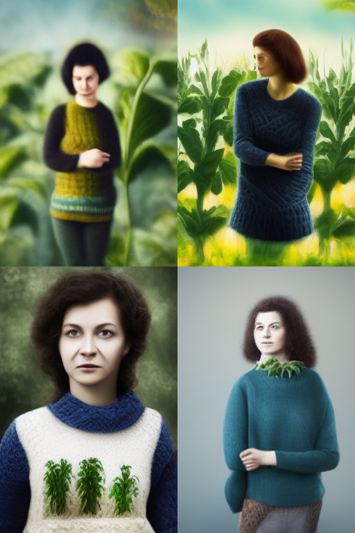
Prompt: character portrait of a woman in knit sweater standing near plants during daytime –fast –cleanportrait
You can see that it has left out a lot of key details. Adding that image prompt back in would fix some problems, but some of these come from the nature of Midjourney.
What you can add to a portrait varies. You may not be able to add a sword to a portrait, because the AI may place it anywhere.
You could render a background and portrait separately, then merge the two images. For instance, if you wanted a sword hanging on the wall, do the wall with the sword and the character in two separate attempts. Specify the color and style, and you can easily merge them together if you pick appropriate variations. Another would be to simply omit any objects you know get misplaced from prompts and add them in later.
AI Considerations with Subject Elements
There are some telltale AI issues here, but we’re getting a lot of what we want already. We have our woman, in more or less portrait form. It doesn’t know where to put the plants.
One solution to this would be to specify something like “forest” instead of simply “standing near plants,” if you remember our issues from above. Unfortunately, Midjourney does not do well with describing perspective and scale, but it’s clear that we could keep generating images if we wanted to get a good result.
However, this is also to the point where we could likely continue rerolling variations until we are happy with results.
You’ll also notice that in one of our images, the woman has no legs. This is doubtless because many portraits do not show that much of their subject, so the AI isn’t going any further with them.
The fact that we’ve got this odd illustration style is partly due to –fast but also a consequence of not specifying our style, which I’ll talk more about when we come to it.
Step 2: Color Influences in Prompt and Output
A subject by itself is enough to usually get an interesting image, but you’ll notice that Midjourney tends to have fairly uninspired colors. This isn’t going to be the case all the time–some subjects just have more interesting features than others in the training dataset–but you can always improve things.
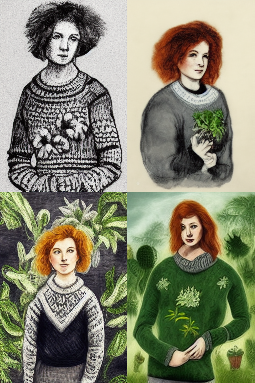
Here, I’ve added in a few things. I’ve specified that the woman is redheaded (red hair gives literally red hair, as if dyed, whereas redheaded tends to give more natural colors), that the sweater is gray, and the plants are green. The green plant bit isn’t necessary, strictly speaking, but it is helpful to have to see that the AI can discriminate between what should be which color in this image, with some bleed-over.
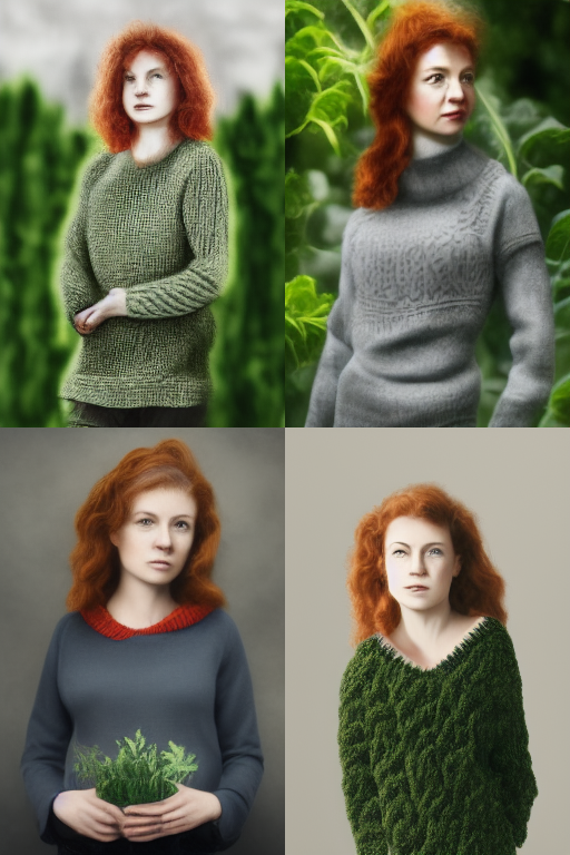
Prompt: character portrait of a redheaded woman in gray knit sweater standing near green plants during daytime –fast –cleanportrait
You’ll notice a few things going on here. There is one portrait where the AI got confused about where to put the plants (prepositions are hard for it), but generally the features and colors are much better defined. We even see some clearer faces and styles, some of which is luck. However, by specifying more detail I have limited the options for it to draw from within its training set, giving me somewhat clearer results.
Step 3: Style Influences in Prompt and Output
I’m going to take a moment now to talk about styles. Adding styles is a great way to reduce any artificial qualities an image has been getting from the AI, but it can also have its own consequences. I’m going to go over three different methods and some of the pros and cons.
Take 1: Ink
Prompt: character portrait of a redheaded woman in gray knit sweater standing near green plants during daytime, elaborate ink illustration –fast –cleanportrait
Here we’ve specified an ink drawing for the character portrait, which gives us more or less what we’d expect. Note that there are some things going on here. For one thing, even though we’re getting a fairly consistent character type, some of the ink drawings don’t have color and the AI is stripping that color when it generates the image.
Because there’s no artist specified, it’s using a variety of styles, though you’ll get fairly consistent results with a more specific image.
However, this style has a minimal effect on our subject, and it looks pretty similar to the images above.
Take 2: Photograph
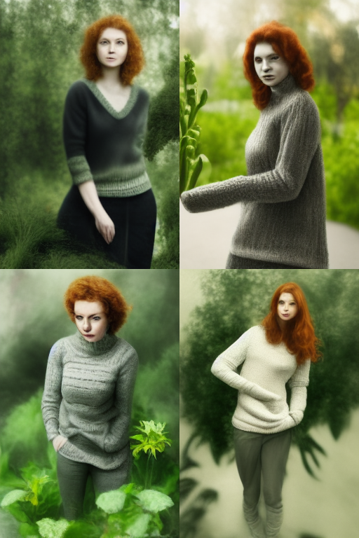
Prompt: desaturated digital photograph:: character portrait of a redheaded woman in gray knit sweater standing near green plants during daytime –fast –cleanportrait
Here I’ve specified a desaturated photograph, taking me closer to the original image. This may look like it’s not very detailed, but when uprendered we would expect to see some more details added.
You’ll notice that the relative proportions of our character and our plants have been informed by the style. Since, photographs are highly mimetic, there are no giant plants next to our woman.
I’ve also split the prompts with a :: marker instead of just a comma. This helps keep the AI from confusing the style with the subject. This reduces the chance that I get an image of a photograph hanging on a wall in an art gallery.
There are some benefits for proportions here as well, since it is aiming for realism. The AI is not great at them, but a coming data set improvement should fix that.
Take 3: Rembrandt
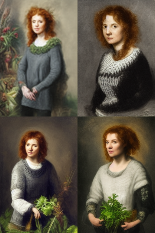
Prompt: character portrait of a redheaded woman in gray knit sweater standing near green plants during daytime, in the style of Rembrandt –fast –cleanportrait
Here we have an artist used for inspiration. I chose Rembrandt because you can tell a lot of the elements of his style here. We got an oil painting, but also facial features and clothing that are informed by his work. The plants even have elements of his style, though they’ve been lost in one of the images.
One reason you might want to use an artist is because it will fill in these gaps. Rembrandt passes on backgrounds, brush-stroke styling, certain types of face, and even clothing styles.
Part 4: Magic
One thing that I haven’t mentioned is that there is a certain element of magic to prompts. If you specify things like “beautiful” or “trending on Artstation” you will wind up adding certain qualities, like lighting and shading, that are probaly desirable.
You can blend styles in particular, which will typically keep the most distinctive traits of each artist or movement chosen. For instance, pop art tends to give nice colorful designs. Various sorts of -punk, -wave, and -core can all give unique and interesting visual results, usually with some associated colors. Specifying your own colors alongside these will give interesting results. For instance, cyberpunk usually gives purple, blue, pink, and orange colors, but specifying black and gold can give a feeling more akin to the Deus Ex reboots.
Take-Aways
Let’s look at some things that we can tell from the examples of the prompt and output relationships shown here.
Image prompts don’t give identical images to the source, and it may not catch all the details, but it will give you a lot of detail and data that can help make a prompt good.
Just using a subject and colors is good, but not enough by itself. Adding a style, either a basic specification of methods or an artist, will improve the final output.
Midjourney is quite versatile as a tool, and when it does things you don’t expect it usually has a reason. If you don’t want these outcomes, find the reason it’s giving them. If you do, experiment to figure out how to replicate them reliably.
Next week we’ll look at some examples of how to work with arguments, upscaled images, and software other than Midjourney to get even better results,
Leave a Reply